Recently at work, I was building a very interesting model for catching investment frauds. We were very keen to make sure that our business partner understood why the model made this decision and not another. After all, the model is supposed to support our team to catch criminals! It is crucial that domain experts understand how estimators work and, in case of errors, they let us know to correct the developed model.
So far I have mainly used the Shap library for explaining a Machine Learning model. This time I found an interesting alternative, which is called Explainer Dashboard!
In this post, I'll just walk you through the Explainer Dashboard package written by Oege Dijk and show you what it can do to better understand how the model works under the hood.
What is Explainer Dashboard?
It's a Python package that makes it easy to quickly deploy an interactive dashboard (in the form of a web application) to help in making a machine learning model work and output explainable. It provides interactive charts on model performance, the power of features, the contribution of a feature to individual predictions, "what if" analyses, or visualizations of individual trees!
Explainer Dashboard customizes the metrics and charts according to the problem the model solves (classification / regression).
Importantly - the library is being constantly developed and more functionalities are being added. Its current main drawback is that it does not yet support deep learning models.
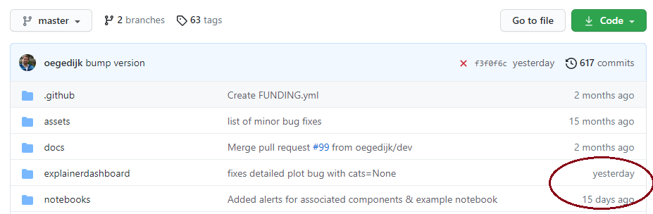
Project's GitHub: https://github.com/oegedijk/explainerdashboard
An example to tinker around on herokuapp: https://titanicexplainer.herokuapp.com/
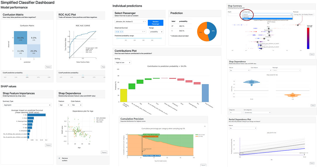
Okay, based on Titanic's immortal dataset, let's go through specific metrics, features, and graphs.
Loading the Explainer Dashboard library
You don't need to know AI dashboard building in dash and charting in plotly. The entry threshold to put up your own dashboard is minimal. All you need to do is install the library:
conda install -c conda-forge explainerdashboard
and you can already enjoy loading packages:
from explainerdashboard import ClassifierExplainer, ExplainerDashboardfrom explainerdashboard.datasets import titanic_survive, titanic_namesimport xgboost as xgb
We will build a simple model using one of my favorite XGBoost model:
X_train, y_train, X_test, y_test = titanic_survive()train_names, test_names = titanic_names()model = xgb.XGBClassifier(n_estimators=50, max_depth=5)model.fit(X_train, y_train)
Note that our goal is not to build the best model, but to understand how it works. That's why I'm building without the fun of selecting optimal features and optimizing hyperparameters.
Now let's add an even nicer description of the characteristics:
feature_descriptions = {"Sex": "Gender of passenger","Gender": "Gender of passenger","Deck": "The deck the passenger had their cabin on","PassengerClass": "The class of the ticket: 1st, 2nd or 3rd class","Fare": "The amount of money people paid","Embarked": "the port where the passenger boarded the Titanic. Either Southampton, Cherbourg or Queenstown","Age": "Age of the passenger","No_of_siblings_plus_spouses_on_board": "The sum of the number of siblings plus the number of spouses on board","No_of_parents_plus_children_on_board" : "The sum of the number of parents plus the number of children on board",}
and we can launch the explainer dashboard:
explainer = ClassifierExplainer(model, X_test, y_test,cats=['Deck', 'Embarked',{'Gender': ['Sex_male', 'Sex_female', 'Sex_nan']}],cats_notencoded={'Embarked': 'Stowaway'}, # defaults to 'NOT_ENCODED'descriptions=feature_descriptions, # adds a table and hover labels to dashboardlabels=['Not survived', 'Survived'], # defaults to ['0', '1', etc]idxs = test_names, # defaults to X.indexindex_name = "Passenger", # defaults to X.index.nametarget = "Survival", # defaults to y.name)db = ExplainerDashboard(explainer,title="Titanic Explainer", # defaults to "Model Explainer"shap_interaction=True, # you can switch off tabs with bools)db.run(port=2021)
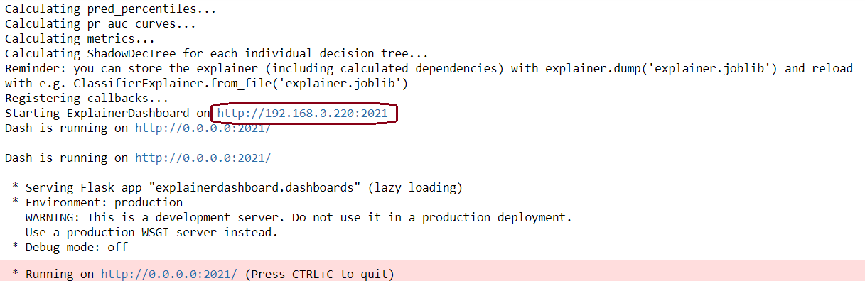
Congratulations. Explainer Dashboard set up. Now we can move on to understanding how our model works.
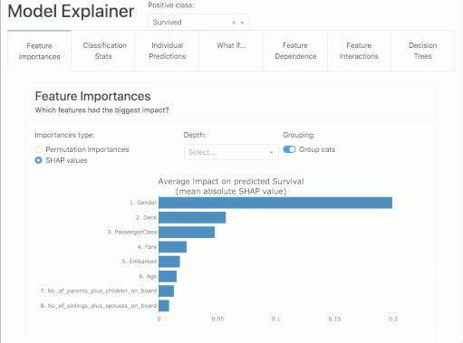
Feature Importance
Here we will find the answer to the question "which characteristics have the greatest impact on the power of the model?". In the report, we will find information on two metrics: the Permutation Importance and the Shapley Values!
Permutation Importance
The idea is this: the importance of a feature can be measured by looking at how much the score of a metric of interest (e.g. F1) decreases when we get rid of a particular feature. For such a check, one can remove the feature from the dataset, re-train the estimator and check the result. However, this requires a lot of time, as it involves recalculating the model after removing each feature. And it will be a different model than the one we currently have, so such a test will not answer us 100% whether it will be the same as the initial model.
Fortunately, someone clever came up with the idea that instead of removing a feature, we can replace it with random noise - the column continues to exist, but no longer contains useful information. This method works if the noise is taken from the same distribution as the original feature values. The easiest way to obtain such noise is to reshuffle the feature values.
In summary, Permutation Importance is a technique for checking features that can be applied to any fitted estimator if the data is tabular. It is fast and useful for nonlinear and opaque estimators.
Permutation importance of a feature is defined as the decrease in the model score when the value of a single feature is randomly reshuffled. This procedure breaks the link between the model's input and the target, so a decrease in the model score indicates how much the model depends on that particular feature.
A negative value says that after the feature is reshuffled, the power of the model for a given metric increases! So a score close to zero or negative means that the feature adds little to the model.
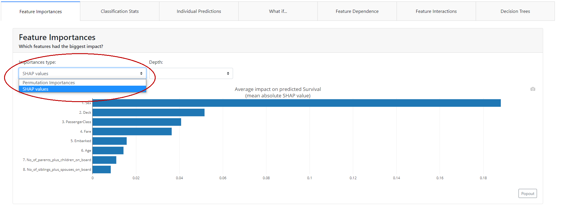
Shapley Values
Shapley Value is a method of assigning profit between players according to their contribution to the total game. Players cooperate with each other in a coalition and derive some profit from it. Intuitively, it can be said that the Shapley Value tells how much a given player should expect to gain from the total given what, on average, he or she contributes to the game in a given coalition.
If you are interested in a detailed description of how Shapley value works and is calculated, I invite you to read the following blog article:
https://christophm.github.io/interpretable-ml-book/shapley.html
Classification Statistics
Here we can find general information about the model along with metrics and visualizations showing whether the classification model is performing reasonably.
At the very top of the tab, we can set a global cut-off for the entire tab. The classification model returns the probability that a given event will occur. If this probability is below the cut-off value, it will take a value of 0, and above it will take a value of 1. For a cut-off threshold set in this way, we will have graphs and metrics calculated in this tab that need a specific class predicted, not the probability itself.
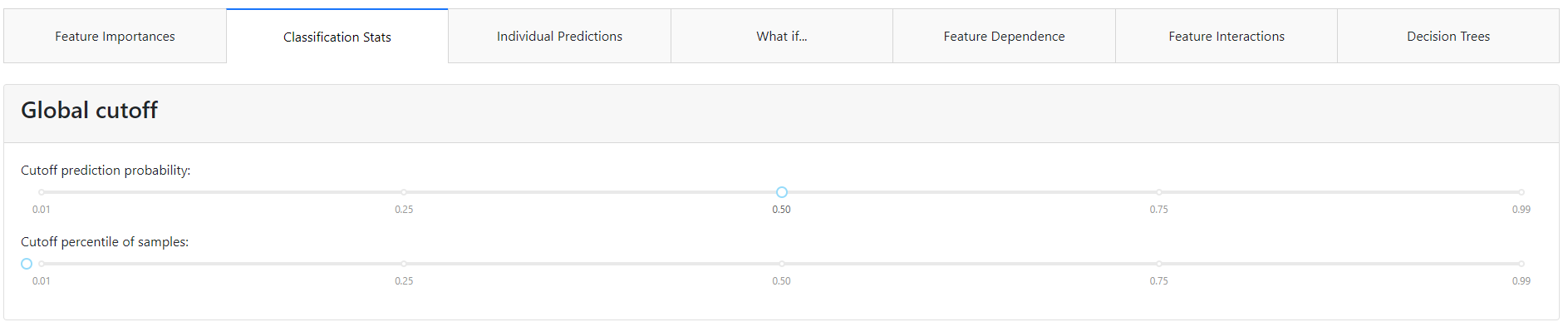
Of course, on each chart, we will be able to change this threshold and visualize for ourselves how this would affect the policy of using a particular model.
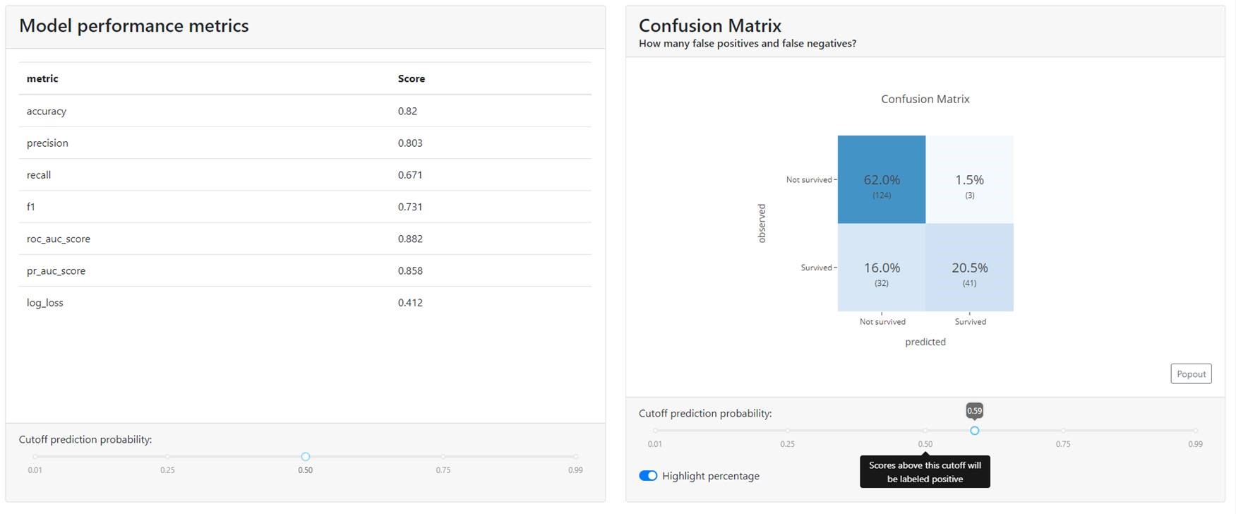
Metrics & Confusion Matrix
At the very beginning, you will find all the well-known metrics that are used with classification models, such as:
- Accuracy,
- Precision,
- Recall,
- F1,
- ROC AUC,
- Precision-Recall curve,
- Log Loss.
In this article, I will not elaborate on each of the metrics. If you don't associate any of them I suggest you take a look at the sklearn documentation, where it is super described: HERE.
Additionally, you will find Confusion Matrix. Here it is possible to play with the cut-off thresholds to select the optimal level. Obviously, if the data were balanced, a value of 0.5 should be a good starting point. You can then tweak the cutoff threshold up and down to work with the business to see how the model performs and classifies customers.
Precision Plot
Think of it this way: we have a probability score for our model and we sort the observations in ascending order. Then we divide the observations into 7 groups (I set the parameter bin_size = 7, because it looked nice to plot).
And now we draw a graph, where:
- in blue, with a column graph, we mark the number of observations in a given group,
- in orange with a line graph % of people in a given group with actual first class (in our case, survivors of the Titanic escape),
- with a green line graph % of people in the second class (unlucky people who did not escape from the Titanic).
Ta-dah:
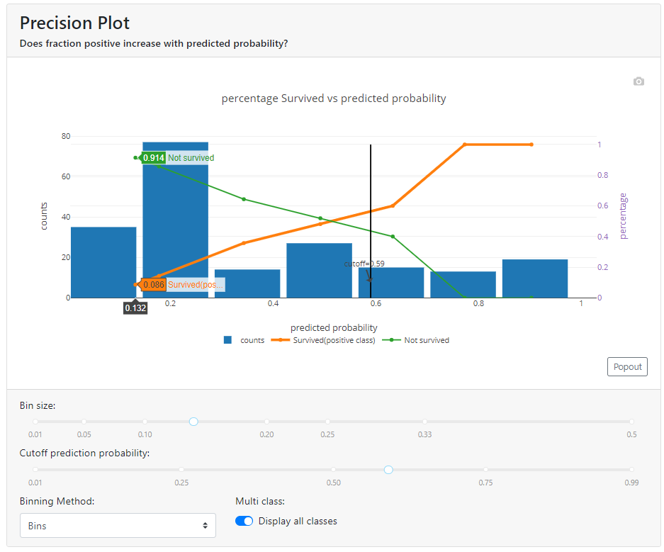
In the above graph, I have reached the expected shape of the orange and green lines. As the value of the probability returned by the model (X-axis) increases, the number of survivors increases (orange line), and the number of non-survivors decreases (green line). If the lines were flat all the way through (still around 50%) or intersected every now and then (once higher the orange line and once higher the green line), it would mean that the model can't differentiate customers properly and doesn't work correctly.
Note that the graph strongly depends on your chosen division method and how many parts you divide it into. See what the shape of the graph looks like for the same model when the number of compartments is significantly increased:
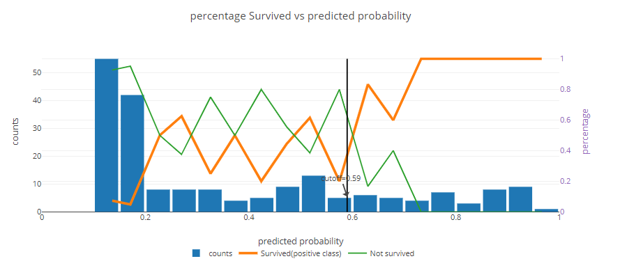
Here you can simply observe that the model distinguishes survivors very well - the orange line shows 100%, which means that in these groups the model did not get it wrong at all. On the other hand, you can see that in the middle between the value of 0.25 and 0.60 the model works middling.
Do not think that something is wrong with the model, only then take a look at the blue bar. In this case, see that there are 10 people in each group. With such a number of people, 1 person is 10%. Hence, there is nothing to be surprised by such fluctuations and simply aggregate the data more.
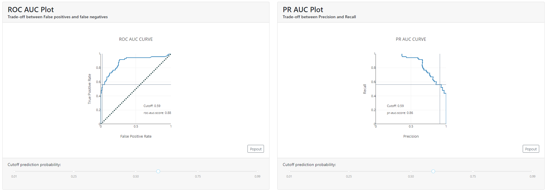
ROC AUC & PR AUC
AUC (Area Under Curve) stands for the area under the curve. So, in order to talk about the ROC AUC or PR AUC score, we must first define what ROC and PR are.
In a nutshell, an ROC curve is a graph that visualizes the trade-off between a True Positive Rate (Recall)(True Positive Rate) and a False Positive Rate (fall-out) (False Positive Rate).
It can be interpreted to mean that this metric shows how good the model's prediction ranking is. It tells how likely it is that a randomly selected positive instance has a higher ranking than a randomly selected negative instance.
PR, on the other hand (Precision-Recall) is a curve that combines Precision (precision / PPV) and Recall (recall /TPR) in a single visualization. For each threshold, you calculate Precision and Recall and plot them. The higher the curve on the Y axis, the better the performance of the model. Of course, the higher the Recall value, the lower the Precision. It's worth considering the cut-off point when the OY-axis graph (i.e., Precision) begins to rapidly decline toward a value of 0.
For this reason, if you care more about the positive class, a better choice is to use PR AUC, which is more sensitive to improvements in the positive class.
The second important thing is that the ROC AUC can distort the picture if the data are heavily unbalanced. This is because the false-positive rate of highly unbalanced data sets is reduced due to a large number of true-negative results.
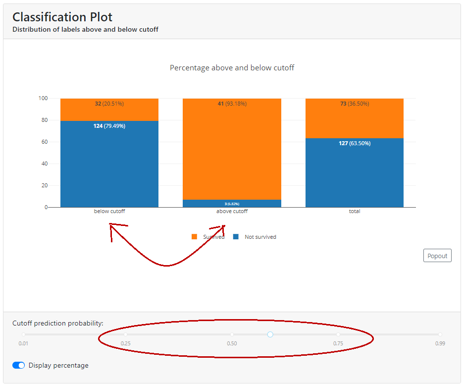
Classification Plot
Here you will find a summary of how the population looks below and above the cut-off.
If you grab the slider and move it left and right, you'll see a cool visualization of how people jump between classes. This will help you explain how the cut-off level will affect the business when it starts using the model and help you choose a parameter.
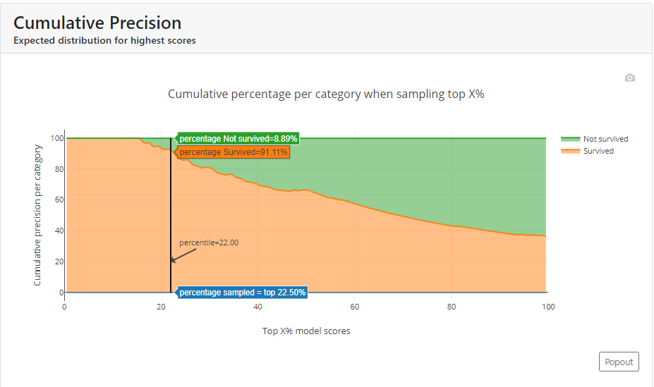
Cumulative Precision
In this graph, we see the percentage of each class if we select the top X % of customers. In the example below, for a cut-off equal to 0.59, you can see that below this value is 22.5% of the population, with survivors accounting for just over 91% and deaths less than 9%.
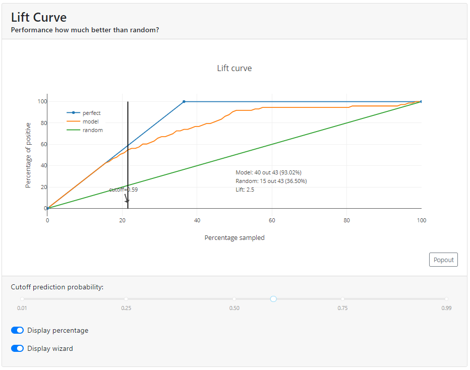
Lift Curve
This is a graph that answers the question of how many times it is better than if we had randomly sampled observations.
In the example below, you can see that for a cut-off = 0.59 lift is 2.55. Our model for this cutoff indicates a positive class for 93.0%, while a random model at this cut-off would indicate 36.5% (93%/2.5).
Individual Prediction
This is where the magic happens for the business audience. Because as we sit down with the domain experts we can disenchant them with each specific case, why the model made the decision it did and not another, and what influenced it and to what extent.
At the top of the tab, we can select a specific observation (e.g. first female passenger).
Let's see what probability the model returned for her. In this case, you can see that Ms. Florence Briggs has a probability of survival of 90.6%.
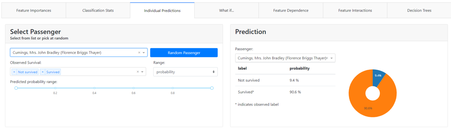
Let's see why.
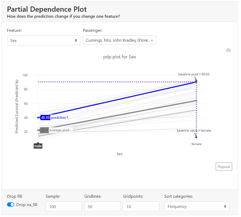
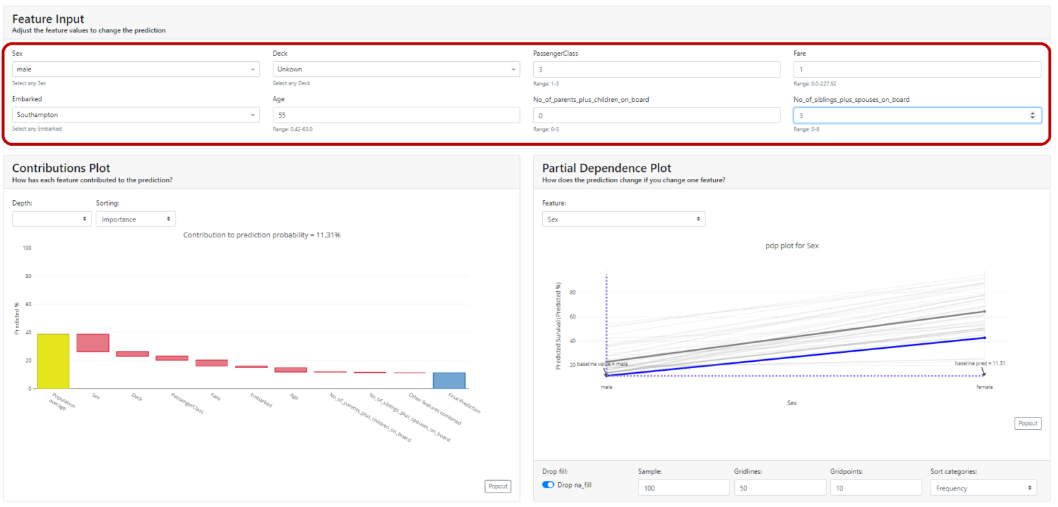
Partial Dependence Plot (PDP)
A partial dependence plot (PDP) shows the marginal effect of a feature on the predicted outcome of a machine learning model. Partial dependence works by marginalizing the output of the machine learning model over the distribution of features from the set so that the function shows the relationship between the features of interest from the set and the predicted output.
If the feature for which you have calculated PDPs is not correlated with other features, the PDPs perfectly represent how the feature affects the average prediction. In the uncorrelated case, the interpretation is clear: a Partial Dependence Plot shows how the average prediction in your dataset changes when the j-th feature is changed.
However, it gets more complicated when features are correlated. We may accidentally create new data points in areas of the feature distribution where the actual probability is very low and this can distort the picture a bit. For instance, it's highly unlikely that someone is 2 meters tall, but weighs less than 50 kg - for such feature combination PDP values may have very high uncertainty.
Let's look at our example. We select the gender feature and see that for our case (blue bold line) if we changed the gender from female to male, the probability of survival would drop from 90.6% to ... 40%. Also in the graph, we have shown the average value for the sample - the bold gray line.
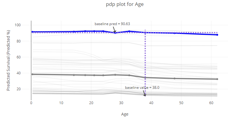
You can look at each attribute and better understand the performance of the model on the whole. Below, age - you can tell from the graph that it didn't matter that much (in the currently tested model!).
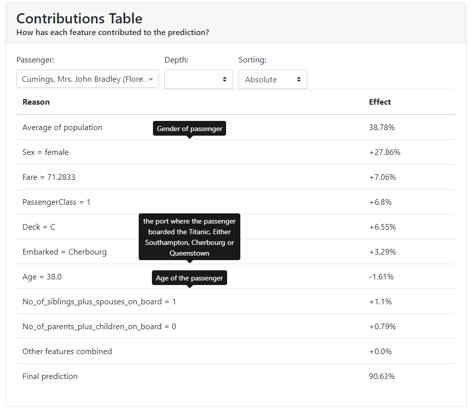
Contributions Plot
The Contributions Plot works on a similar principle as the PDP except that it shows the contribution of each variable individually and what effect it had on the final outcome. Its main advantage over PDP is that we can plot the impact of more than 2 features on prediction for a particular observation.
You can see that in our case, the characteristic that contributes the most is gender, and the second most for that person is the price they paid for the ticket.
In addition, the colors indicate what worked to increase the probability of survival, and in red to decrease the probability of survival.
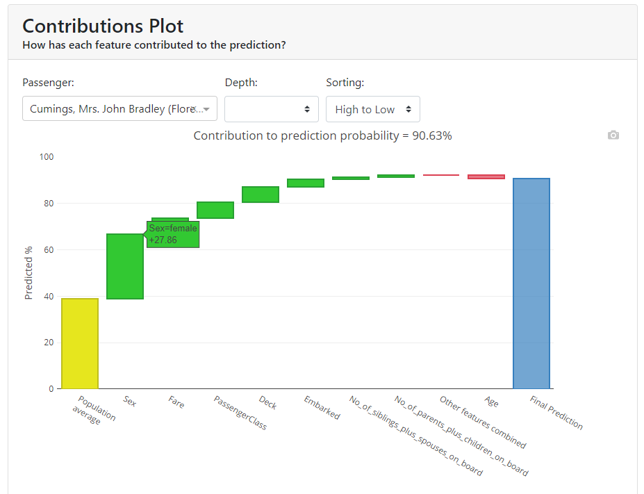
You have all the results collected below in a table:
What if
In my opinion, this is the most interesting section. It shows the same thing we saw in the individual evaluation tab with the difference that we can modify all the features at will and see what effect it had on the model.
If you sit down with domain experts at this tab they can verify that the model works intuitively and can give interesting input regarding where they think the model is not quite behaving correctly. It is a common technique for discovering a model's fairness and stability.
Feature Dependence
Here we have two graphs that will show us how the values of given characteristics affect the increase or decrease in probability based on Shapley Values.
More about Shap itself HERE.
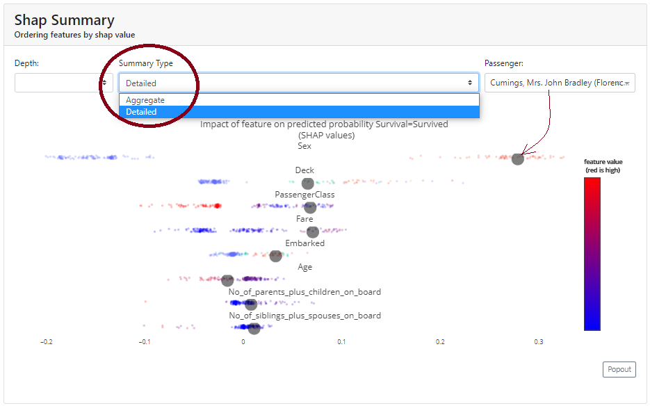
Shap Summary
Here, in the basic version, we get the Shap chart for the features we already know from the first tab. However, it differs in that we can view it in detail, and then it draws us observations. We can select a particular observation and see where it is in the background of the whole.
In addition, from the graphs, we can see which characteristics increase the probability of survival (those to the right of 0 on the OX axis). Conveniently, we have a colored scale, where blue corresponds to smaller values and red - larger ones).
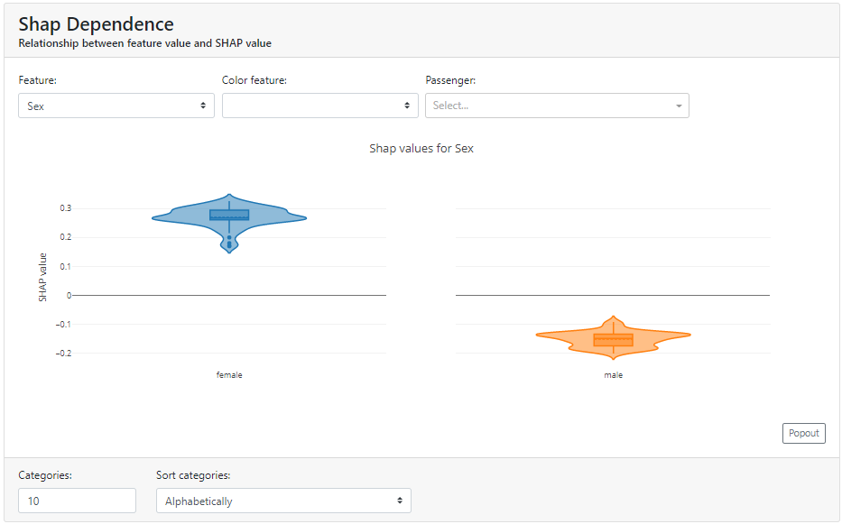
Shap Dependence
Here we can take a closer look at a particular feature of how the distribution looks in terms of Shapley Values.
Below you can see how strongly gender in the case of the Titanic data affects survival rates:
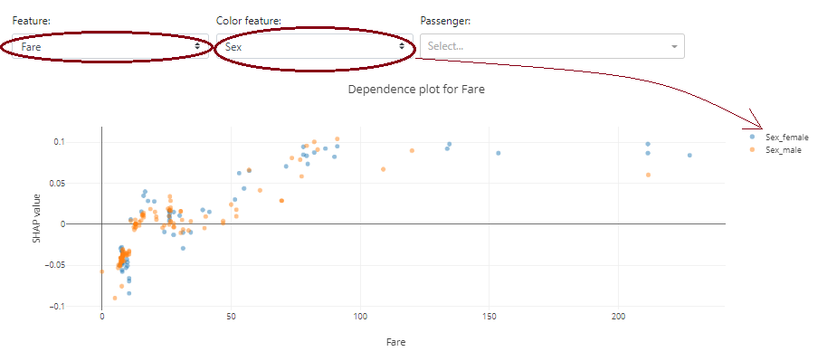
An interesting option is that the graph is selected according to the types of data. In the case of the continuous data "Fare", a dot plot is presented instead of a violin plot.
Note that you can add an additional color based on another feature to see the other variable.
Below, at first glance, you can't see the dependence of ticket price ("Fare") on gender - the blue and orange colors are mixed. On the other hand, it is immediately transparent that the "Fare" variable itself has an impact on the positive probability of survival - the higher the "Fare" value, the more characteristics have a positive Shapley Value.
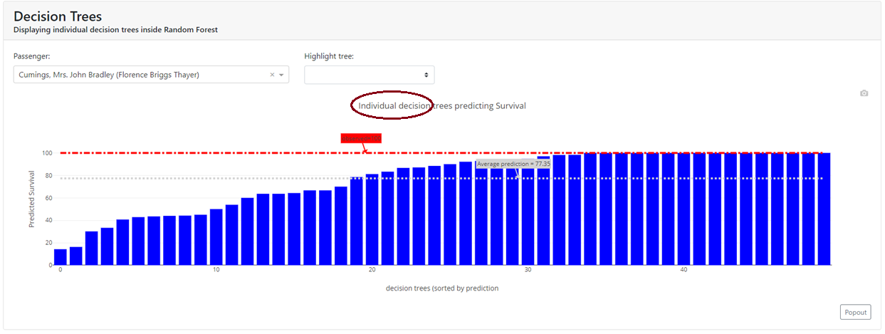
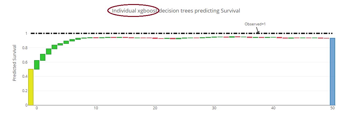
Decision Trees
In this tab, we have visualized how successive trees counted and we can visualize a specific tree. This allows us to closely examine the "guts" of our ensemble model.
It's worth noting that depending on the model we have, these can be a tad different graphs.
Below I have shown two examples:
(a) for the Random Forest, where we have shown each of the 50 trees that gave a probability for a given observation:
(b) for XGBoost, where each successive tree is shown:
In addition, for tree algorithms, we can generate a specific tree as it looked:
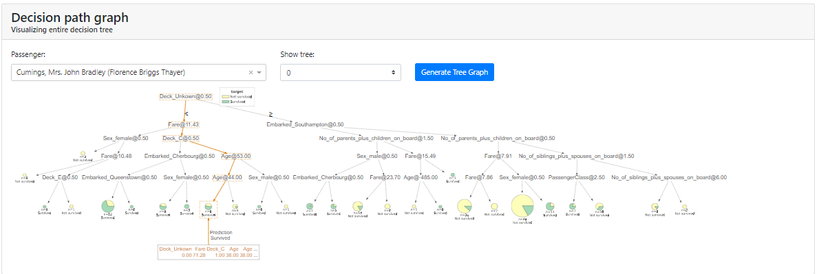
Note: In my case, in order for me to display the tree I had to install the dtreeviz package as described in the installation instructions: https://github.com/parrt/dtreeviz.
Regression Statistics
Here you will find general information about the regression model, along with metrics and visualizations showing whether the regression model is working reasonably. This tab is present if our model predicts a continuous value, such as product price, growth, or income.
At the very beginning, you will find any metrics you are familiar with that are used with regression models, such as:
- Root Mean Squared Error,
- Mean Average Error,
- R2 Coefficient.
Also at a glance, instead of the Confusion Matrix, we have a "Predicted vs Actual" chart. It immediately illustrates how strongly the variable predicted by the model differs from the actual value.
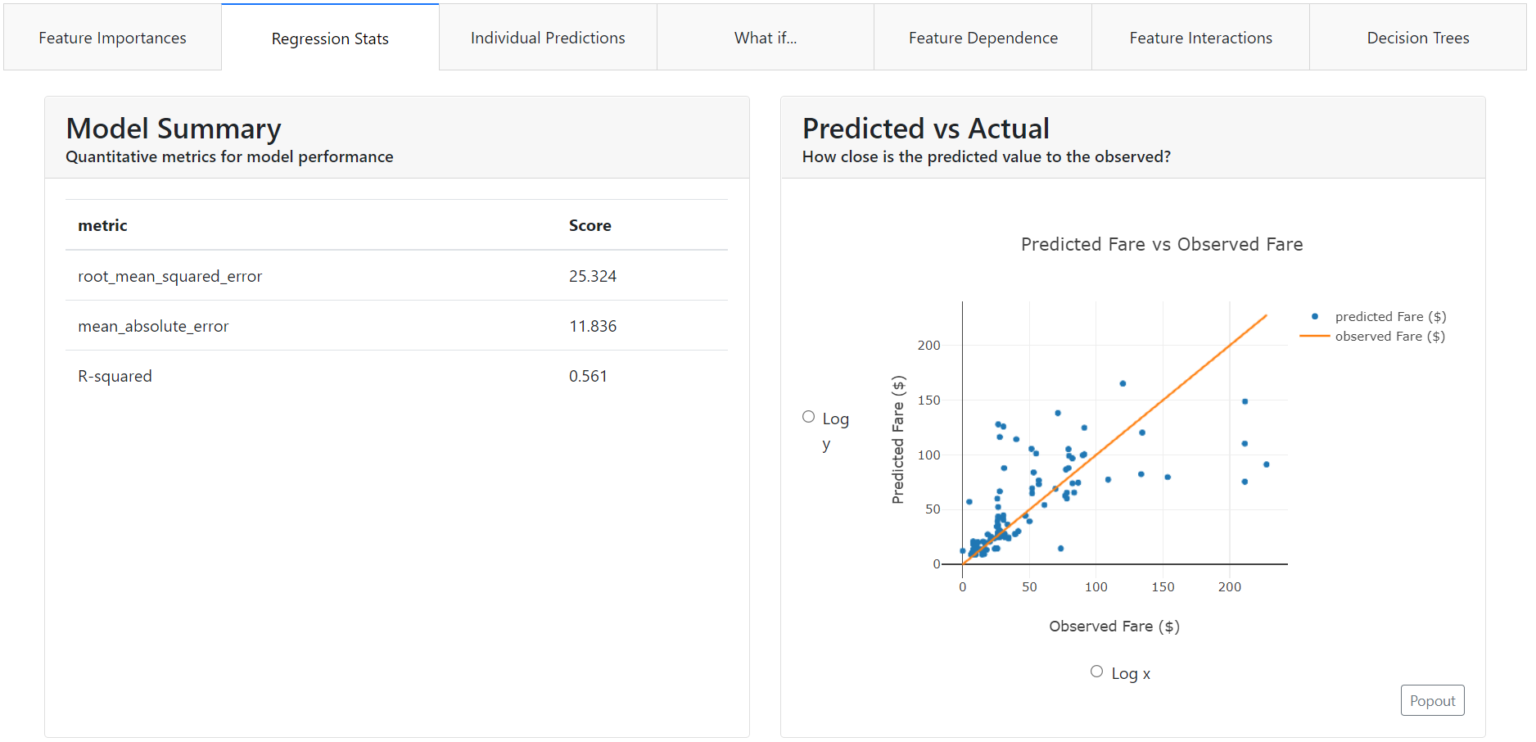
In our case, we can see that the model predicting the ticket price ("Fare") did much better at predicting low amounts. The blue points depicting the actual values are closer to the predicted value (orange line).
In addition, you can simply choose a logarithmic scale on the chart.
Residuals chart
Another graph showing how and where the model is wrong is the residuals chart.
Residuals are the differences between the actual value and the value predicted by the model. Immediately from the chart, you will see on which values the model underestimates the predicted ticket price and on which it overestimates.
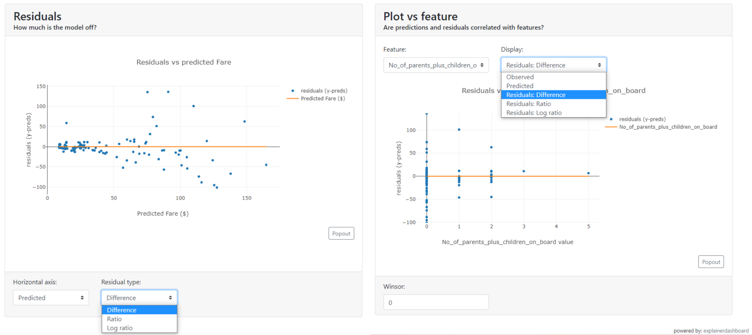
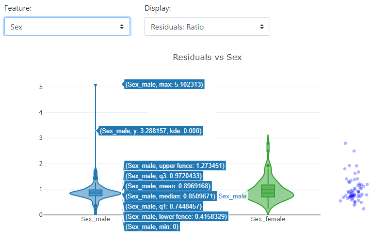
Plot vs. feature
With this chart, you can get a better understanding of what the distribution looks like for the selected feature:
- predicted values,
- actual values,
- residuals,
- the ratio of residuals,
- the logarithm of the residuals.
It is worth noting that, depending on the distribution of the selected features, the graph will take different forms: a scatter plot for discrete or a violin plot for continuous.
Summary of the Explainer Dashboard
You can adapt the Explainer Dashboard to suit you, i.e. fire only the appropriate tabs, expose applications in a new window, or launch in Jupiter Notebook.
We hope you will be able to use this package to present the results of your work.
This article is based on an article by Mirosław Mamczur published on his blog: miroslawmamczur.pl
Translation and publication on airev.us made with the consent of the author.